The problem
A size limit is a design failure that arrives as a user's fault
A photo taken on a phone is routinely twelve megapixels and several megabytes. The form that rejects it allows five. The message says the file is too large. It does not say by how much, or what to do, or which of the four things you could change would work.
So the person guesses. They screenshot the photo to shrink it, which loses quality and often does not help. They email it to themselves. They give up on a government form, a job application, an insurance claim. The system moved a technical problem onto the person least equipped to solve it, and then blamed them for it.
Compresso exists to absorb that back. The design question is narrower than the product one: if the fix runs on the person's own device in under a second, what should it look like, and how little should it ask of them.
Version one
Warm, editorial, coherent, and completely predictable
I built the first system around a metaphor I still like. Compresso, espresso, pressing. A small print shop: paper, ink, pressure, impression. Warm off white stock, a display serif with real character, letterpress deboss instead of drop shadows, hairlines instead of boxes, and a single burnt vermilion accent.
It was coherent. Every decision traced back to the metaphor, which is the test I usually apply. It shipped. And when I put it in front of the person it was for, the response was that it looked serious, not modern, and not a product you would want to keep using.
That is a hard note to take on work you like. It is also the correct note, and here is the part that made it undeniable.
The thesis
The photograph is the only colour on screen
The second system starts from one sentence, and every decision is downstream of it. The interface has no opinion about your image, so it never puts a hue next to one.
Ground is true black. Not a near black, not a charcoal. Committing to it is what makes a photograph sitting in the middle of the screen look lit from behind. Light mode is a real inversion, paper white and ink black, not a tinted variant of the dark one. There is no accent colour anywhere in the chrome. A single alert red exists and fires on exactly one condition, when a PNG you chose to keep has grown, and nowhere else in the app.
That restraint is the risk I took, and it is a deliberate one. The second most common generated look is a near black background with one bright acid accent. Avoiding both defaults meant removing the accent entirely rather than swapping it, which only works if the content is strong enough to carry the screen. Here the content is a photograph, so it is.
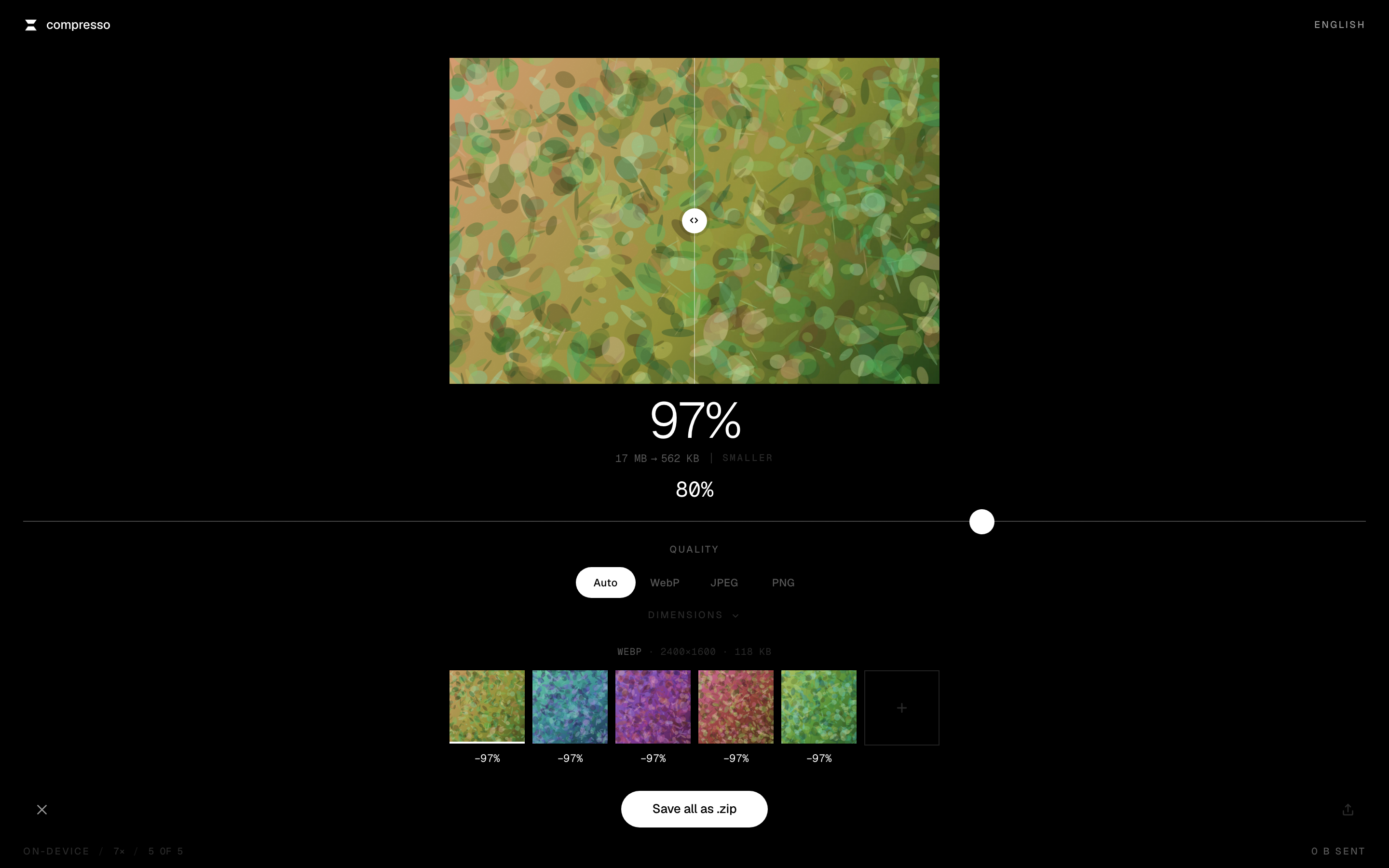
The working screen. Everything except the photograph is black, white, or a step between.
Structure comes from space and hairlines. There are no cards anywhere in this interface.
Type does the work that colour usually does. One family for the interface and one for anything numeric, because bytes and dimensions are data and should look like data. Labels are ten pixels, uppercase, tracked wide, which is what makes them read as drawn rather than as leftover text. The savings figure is set light rather than heavy, because at that size weight would shout where scale already speaks.
Radii are varied and meaningful rather than uniform. Photographs get no rounding at all, because a photograph is a rectangle and rounding one is a small lie. The only round thing on the screen is the primary action, which is exactly what makes it read as the action.
The signature control
One slider, doing the job a whole panel used to do
Version one had an inspector rail on the left, the pattern every desktop tool reaches for. A rail turns the photograph into a thumbnail beside a form. So I deleted it and put the controls under the picture, in the order you reach for them, which also collapsed desktop and mobile into one layout rather than two.
What replaced it is a single hairline that runs the full width of the screen, a knob large enough to look reachable, and the value floating directly above it so your eye never leaves the thing you are dragging. A tick marks the default. It does not snap to it, because a snap is a decision the interface makes for you. It answers when you cross it: the tick grows and brightens for a beat, and on hardware that has one there is a four millisecond haptic.
Secondary controls fold away. One tool on screen at a time is the discipline that lets the photograph keep the room.
Motion
A system where overshoot cannot be expressed
The brief asked for microinteractions that feel smooth and satisfying, and explicitly not bouncy. Prose in a design document does not survive implementation, so I made it a property of the system instead.
There are four easing curves. Every control point in all four sits at or below one, which means a curve that overshoots its target cannot be written in this vocabulary. There are no springs in the app. Not springs tuned not to bounce. None. Durations are 120, 240, 360, and 520 milliseconds, and the longest one is spent exactly once per batch.
The blur is the progress bar
A thumbnail does not fade in. It resolves, like paper in developer, and the blur clearing as progress climbs is the progress indicator. There is no bar behind it, because there does not need to be one.
Two pixels upward
When a file finishes, its tile settles two pixels up. It is subliminal, and it is the entire thesis of the product expressed as movement. The thing is lighter now.
A centre with weight
The comparison handle decelerates into the midpoint rather than snapping to it. You can still put it anywhere. The middle just costs a little more travel, the way a detent does on a well made dial.
The savings figure rolls like a mechanical counter, and only the digits that actually changed move, rightmost first. Tabular figures are not optional there: without them the readout reflows on every tick and the effect reads as a glitch instead of a mechanism. When a batch finishes, every figure in the strip resolves in sequence and the total lands behind them. That is the highest emotion moment in the product, and it happens once per batch rather than once per file.
Reduced motion is defined once for the whole system rather than per component. Transforms collapse, the counter sets its value directly, and the opacity ramp on the develop reveal stays, because a fade is not motion and removing it would leave those users with no sense of progress at all. The interface still has to read as finished, not as stripped.
Seven languages
Localisation is a design constraint, not a translation task
Compresso ships in English, Spanish, French, German, Italian, Brazilian Portuguese, and Simplified Chinese. It detects your system language and lets you override it. All seven load with the app rather than on demand, because switching language must not require a network when the whole promise is that nothing does.
This interface is almost entirely numbers, which makes the usual approach fail quietly. Translating the labels and leaving 1.5 MB in a French UI is the tell that a product was localised carelessly. Every byte count and percentage goes through Intl.NumberFormat, so French and German read 1,5 MB, and a German percentage carries the space it is supposed to.
Chinese costs zero font bytes
The Latin typeface is scoped by unicode-range, and Chinese falls back to the system CJK stack. A CJK webfont runs to several megabytes and would have wrecked the offline budget. The system stack costs nothing and looks native, which was the better answer anyway.
Every screen reviewed in German
German runs roughly a third longer than English and compounds do not wrap. The save button stacks its three states in one grid cell so it sizes to its longest label in whatever language is active. That is what stops Wird gepackt clipping a control measured for Packing.
Copy branches on input rather than screen width. A phone has no cursor to drop with and no keyboard shortcut to paste from, so on touch the empty state stops describing gestures the device cannot perform and offers what it can: pick a few photos, straight from your camera roll. A narrow window on a laptop still gets the desktop copy, because the question is what you are pointing with, not how wide the viewport is.
Identity
A mark chosen at sixteen pixels, not at five hundred
Most marks are designed large and then checked small. I did it the other way round. I drew four candidates, rendered each at 512, 32, and 16 pixels, and looked at the smallest row first, because the browser tab is where this mark actually lives.
A plain ellipse was legible and generic. A ring lost its hole at favicon size and turned to mush. A descending bar stack read as a signal meter. The one that survived is two solid plates closing on each other with a gap between them: every edge straight, every corner hard, and wide flat bases that are the last thing to disappear as the size drops. Those bases are what make it read as pressure rather than as a shape.
In the header the same glyph appears, and the two plates close once on load. Then they never move again, which is the difference between a detail and a distraction.
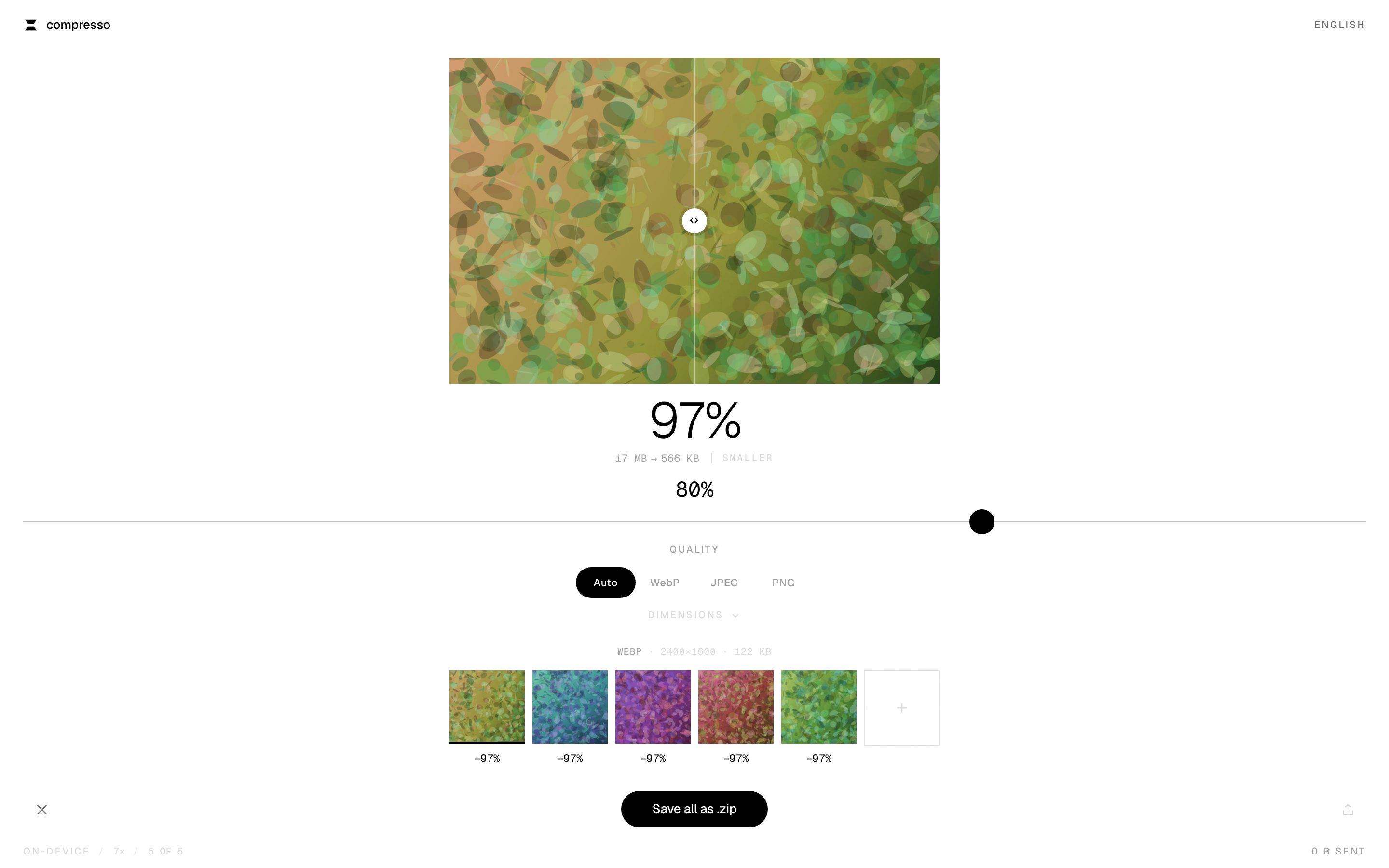
Light mode is a genuine inversion rather than a tinted variant. Same discipline, opposite ground.
The mark sits top left. It is the same shape as the app icon, at sixteen pixels.
What it costs
Nothing, in every sense the user cares about
No account, no upload, no queue, no watermark, no size cap, no paid tier. Install it and it works on a plane. The status bar says 0 B sent on every screen, and that is not a slogan: you can open developer tools and watch the network stay silent while a hundred photos process.
There is no analytics either. The strongest privacy claim available to a tool like this is zero network requests after install, and any measurement I added would have cost me that claim. I would rather have the claim.
The other half
How this was built
Design decisions in this project were only shippable because of architectural ones, and the two studies are written to be read together. The engineering case study covers the compression core, a worker pool that keeps the interface at sixty frames while a large batch runs, the architectural seam that made that possible for 231 bytes, and four bugs that only appeared once I drove the real thing.
Work with me
I design products like this, end to end
I am a product designer who builds. On this project that meant direction, the design system, motion rules, seven languages of copy, the icon set, and the code that shipped all of it. If you are hiring for a designer who can hold a point of view and still get it into production, I would like to hear about it.
Available for remote work